Channel Hyundai Card
A video streaming website for Hyundai Card Branding and Marketing group.
( Hyundai Card 2016 )
Intro
The site produces videos that inspire users from various fields such as finance, art, music, and design to show the lifestyle portrayed by Hyundai Card. My responsibilities include content display strategy, information architecture, video player UX design and content recommendation algorithm in this project.
Role
Lead UX Designer / Contents Strategy, Market Research, A/B Test, Admin Design, Video Recommend Algorithm, Wireframes, QA
Company
Hyundai Card
Periode
April 2015 – January 2016
Mission
Create a responsive video streaming website

Research
At the beginning of this project, we defined project concept as “Horizontal User Experience”, “Card Designs of various dimensions”, "Hash tag based content search”. These were three pillars the project was built on.

Video oriented UX research
Effective UX methods were considered in a number of ways in preparation for the small number of content available in the early stages of the site opening. I considered a horizontal scrolling website and suggested tags. There were two UX strategy points.
-How to effectively expose a few contents at the beginning of the site?
-Navigation configuration to allow continuous viewing of content.

Recommendation Algorithm
Due to the small number of contents and limited categories of contents available on the early stages of the site opening, it is paramount that we make best use out of the limited content. The contents that show up at the top of the site need to be dynamic, grabbing attention of visitors, leaving a good impression, and ultimating inviting visitors to return to the site in the future. Hence, we spent a lot of time crafting recommendation algorithm on the main page.
Draft Design
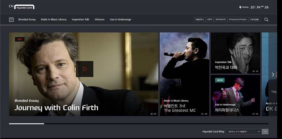
Main Home
A horizontal scrolling site was designed such that the grid layout changes according to the importance of the content.

Channel List
A channel list page was designed such that it invites user to consume the content as a bite-sized snacks.
Qualification
Horizontal scrolling UX is unorthodox to general public users that could be novel or impractical. We decided to run usability tests to validate our idea before moving forward.

Usability test
For the usability test with the first version mock-up, we checked on the following:
-Video channel usage behavior
-Device preference
-Content expected from service concept
-Site first impressions
-Contents interest
-Navigation usability
Result
User tests showed that most visitors felt that the site was fun and novel. However, there were difficulties in usability and the content was not very compelling. Before launching the website, we decided to increase the video categories that users would see.
Problems
From inception, this website had concerns around contents. The primary goal of the site being a marketing channel to promote Hyundai Card brand and Hyundai Card products, contents could be seen uninteresting and repetitive. In fact, user tests showed that the site content received positive remarks from those that were interested in applying to Hyundai Cards. We approached these problems with the solutions below.
Storytelling
First, instead of a direct marketing on the product, we created stories that promotes viewers indirectly connect to the product.
To promote the travel library product, we partnered with a British movie star, Tom Hardy, to cast his philosophies on travel in our video.
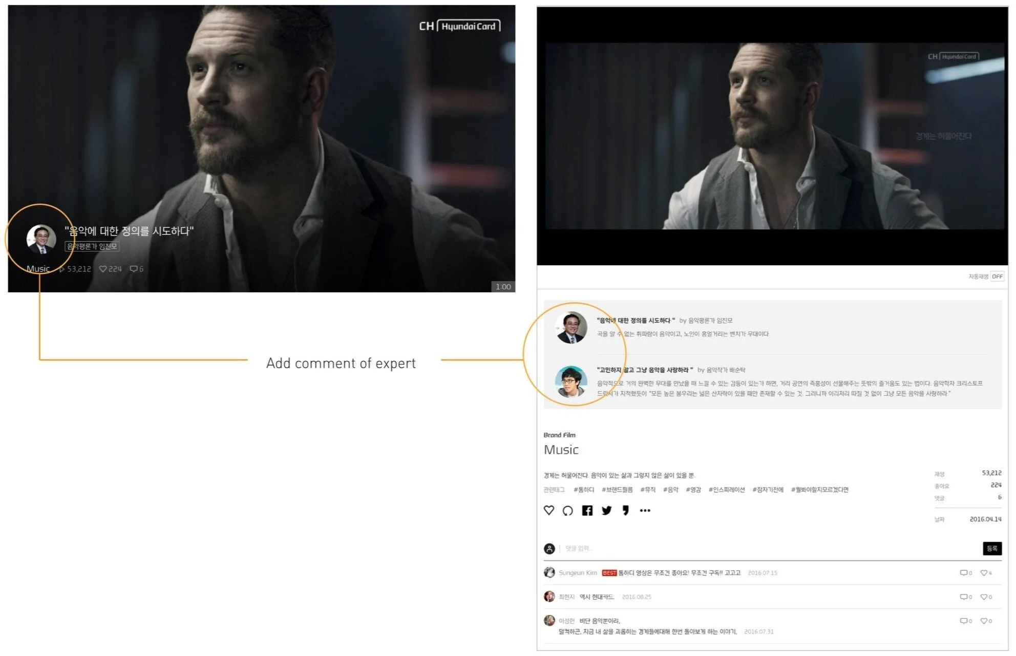
Comments of Experts
Viewers enjoy reading responses and commentaries as much as the video. Building on this, we added comments from experts of various disciplines to make the content more interesting and reliable.

